
In May last year; I did some changes to the dark mode theme and syntax highlighting on this blog. Resulting in higher contrast, improved syntax highlighting in light mode, and a few others things.
It took me a while to get around to document this, but here we go 👇
Table of contents
Introduction
Dark mode is an essential feature for any website — sitting in my dark and cozy home office, I use dark mode whenever and wherever I can.
As I post quite a lot of code; good syntax highlighting is also very important. Luckily Hugo comes with highlighting from Chroma, but it still needs proper styling to match the website theme.
I’ve spent time making sure this website looks good in both light and dark mode. In this post I’ll go through the things I changed to make it better.
Dark mode
Colors
On this blog, I’m using a modified Hello Friend theme, its dark mode had too little contrast in my opinion. So I started looking into guidelines and recommendations for dark mode colors.
Initially I thought an all black background was a good idea, but it turns out — it’s not. Light text on a completely black background can be a little hard on the eyes, creating a visual fuzzing effect. I also think a black background makes the site look very “flat”.
Material Design has lots of information on dark mode, and they recommend using #121212 as the background color. So that’s what I went with 🙂
Below is the changed I did to the dark mode colors on my Hugo theme:
 @media (prefers-color-scheme: dark) {
   body:not(.light-theme) {
     /* dark theme colors */
-    --background: #292a2d;
+    --background: #121212;
-    --background-secondary: #3b3d42;
+    --background-secondary: #1e1e1e;
-    --header: #252627;
+    --header: #0f0f0f;
-    --color: #a9a9b3;
+    --color: #bdc1c6;
-    --color-secondary: #73747b;
+    --color-secondary: #666666;
-    --border-color: #4a4b50;
+    --border-color: #232323;
   }
 }
Images
Next, in dark mode, I slightly reduce the image brightness while increasing the contrast. This gives a faint “dampening” effect, making images a bit darker.
In light mode images have no filters:
img {
    filter: none;
}
But in dark mode; a brightness and contrast filter is applied:
img {
    filter: brightness(.9) contrast(1.1);
}
Below you can see images in “light” and “dark” mode, notice the lower right part of the images are slightly darker:
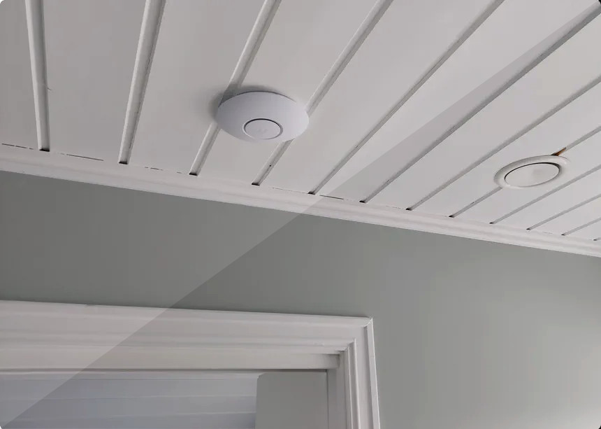
It’s important to not overdo it, otherwise some images may end up too dark.
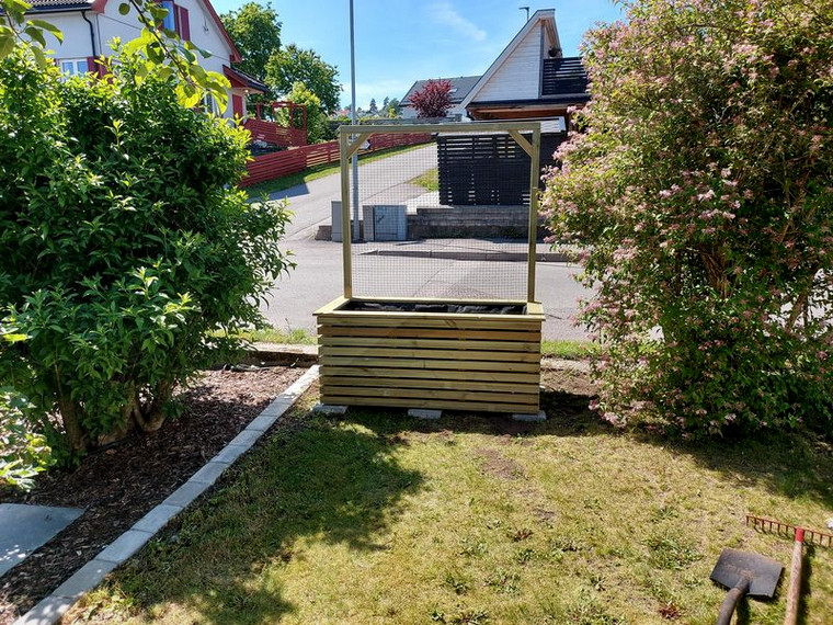
Shadows
Shadows creates depth, and is easy on a light background. In dark mode however — it’s a bit tricky. If the shadow is too bright, it will look more like a glow than a shadow.
My theme had the same shadow in light and dark mode, but it was subtle and not visible in dark mode. So I changed the shadow opacity in dark mode from 0.15 to 0.50, but kept it black.
Theme SCSS for menu, cover images, and code blocks:
.menu {
  --color: rgba(0, 0, 0, .12);
  --shadow: 0 8px 20px var(--color);
.post {
  &-cover {
    img {
      margin: 0 auto;
      border-radius: 8px;
      box-shadow: 0 12px 40px rgba(0, 0, 0, .15);
    }
  }
}
pre.chroma {
    border-radius: 4px;
    border: 1px solid var(--border-color);
    box-shadow: 0 3px 10px rgba(0, 0, 0, .15);
}
When in dark mode, I set the following shadow instead:
.menu {
    --shadow: 0 8px 20px rgba(0, 0, 0, .5);
}
.post-cover img {
    box-shadow: 0 12px 40px rgba(0, 0, 0, .5);
}
pre.chroma {
    box-shadow: 0 3px 10px rgba(0, 0, 0, .5);
}
I think this produces some depth also when in dark mode, without being too obvious. It’s not easy to spot on the image below, but the right half of the image has shadow with 0.5 opacity:

Styling
Putting these things together, my light and dark mode specific styling looks something like this:
@mixin light-theme {
  /* light theme color */
  --background: #fff;
  --background-secondary: #eaeaea;
  --header: #fafafa;
  --color: #222;
  --color-secondary: #999;
  --border-color: #dcdcdc;
}

@mixin dark-theme {
  /* dark theme colors */
  --background: #121212;
  --background-secondary: #1e1e1e;
  --header: #0f0f0f;
  --color: #bdc1c6;
  --color-secondary: #666666;
  --border-color: #232323;
  .menu {
    --shadow: 0 8px 20px rgba(0, 0, 0, .5);
  }
  img {
    filter: brightness(.9) contrast(1.1);
  }
  .post-cover img {
    box-shadow: 0 12px 40px rgba(0, 0, 0, .5);
  }
  pre.chroma {
    box-shadow: 0 3px 10px rgba(0, 0, 0, .5);
  }
}

body.light-theme, :root {
  @include light-theme;
}
body.dark-theme {
  @include dark-theme;
}
@media (prefers-color-scheme: light) {
  body:not(.dark-theme) {
    @include light-theme;
  }
}
@media (prefers-color-scheme: dark) {
  body:not(.light-theme) {
    @include dark-theme;
  }
}
prefers-color-scheme media feature (your browser telling what it prefers) or manually by the user.
Syntax highlighting
Lastly; syntax highlighting — this is where I did the biggest changes. Originally; code blocks was black in both light and dark mode — this works on in dark mode, but becomes quite harsh in light mode.
I don’t think a dark code block with bright text, is very readable in light mode. The text gets overwhelmed by all the white surrounding it.
To get two different syntax styles; I generated both light and dark Chroma styles, and stored them in my assets/css folder:
hugo gen chromastyles --style=github > assets/css/syntax-light.css
hugo gen chromastyles --style=github-dark > assets/css/syntax-dark.css
Then, in my style.css, I import either the syntax-dark or syntax-light style — depending on the theme:
body.dark-theme {
    @import 'syntax-dark';
}
@media (prefers-color-scheme: dark) {
    body:not(.light-theme) {
        @import 'syntax-dark';
    }
}
body.light-theme {
    @import 'syntax-light';
}
@media (prefers-color-scheme: light) {
    body:not(.dark-theme) {
        @import 'syntax-light';
    }
}
prefers-color-scheme media feature (your browser telling what it prefers) or manually by the user.
I had to change a few things in the generated Chroma styles, for it to match my theme:
assets/css/syntax-light.cs
-/* Background */ .bg { background-color: #ffffff; }
-/* PreWrapper */ .chroma { background-color: #ffffff; }
+/* Background */ .bg { color: var(--color); background-color: var(--background); }
+/* PreWrapper */ .chroma { color: var(--color); background-color: var(--background); }
 /* Other */ .chroma .x {  }
 /* Error */ .chroma .err { color: #a61717; background-color: #e3d2d2 }
-/* CodeLine */ .chroma .cl {  }
+/* CodeLine */ .chroma .cl { color: var(--color); }
assets/css/syntax-dark.css
-/* Background */ .bg { color: #e6edf3; background-color: #0d1117; }
-/* PreWrapper */ .chroma { color: #e6edf3; background-color: #0d1117; }
+/* Background */ .bg { color: var(--color); background-color: var(--background-secondary); }
+/* PreWrapper */ .chroma { color: var(--color); background-color: var(--background-secondary); }
 /* Other */ .chroma .x {  }
 /* Error */ .chroma .err { color: #f85149 }
-/* CodeLine */ .chroma .cl {  }
+/* CodeLine */ .chroma .cl { color: var(--color)  }
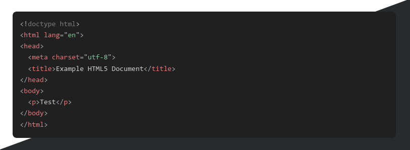
And there you have it! White code block when in light mode, and dark grey code block when in dark mode. Easy on the eyes, and to read, in both modes:
Final thoughts
Having different syntax highlight for light and dark mode really improved the readability of my code blocks. The other changes are subtle, but together help improve the overall design consistency — in my humble opinion.
This post has been in my drafts folder for a long time… I wasn’t sure how to write it — how to best explain, and show, the subtle changes. I’m happy with the result, and the post being moved from drafts to posts 😎
🖖
Last commit 2024-04-05, with message: Tag cleanup.